When planning your website, there are many aspects to consider, such as a colour scheme, layout, fonts and more. You also need to consider the experience that you want users to have on site. In this blog, we’re answering the question, what is responsive web design?
What is responsive web design?
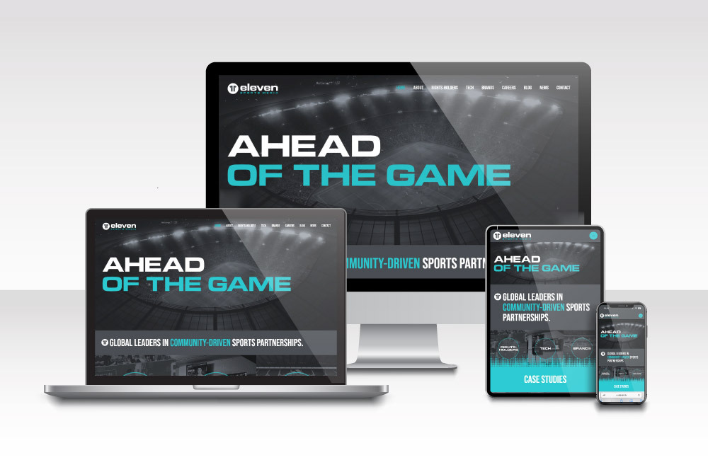
A responsive design means that your website changes so that it always provides the best user experience. This can also be referred to as being ‘mobile friendly’. Adjustments may include your site altering the layout depending on the screen size it is being displayed on. In addition to layout elements, the font size and responsive images will also automatically adjust to fit the web page and browser width.
More websites are viewed on mobile devices than they are on desktops nowadays, so it’s very important that your website is mobile-friendly. As a result, search engines like Google index the mobile version of a site before the desktop version. This means that the mobile version is more likely to rank.
Without a responsive design, you’ll find that your website doesn’t fit the screen properly and generally might not work very well when displayed on screens that it hasn’t been optimised for.
Web developers use media queries and CSS styles to optimise web pages for different devices and screen dimensions. A few examples include desktops, mobile phones and even TV screens, which all vary in screen width – media queries allow them to display responsive web designs.

Why is responsive website design important?
User-friendly – the website works as it should on all devices
Having a responsive design is crucial in today’s digital landscape. It’s quite common for users to switch between devices when searching for the same product on a website. If your website fails to respond to the change in screen size, you may find yourself losing customers. When sites aren’t optimised correctly, many features will fail to work as they are intended to.
Many people underestimate the benefits of having a website that works efficiently. With a great user experience, you’ll find that you’ll have more visitors, and it can help you to build brand loyalty too.
For your website to continue working efficiently, you’ll need to maintain it and complete updates when necessary.
There’s only one site to update
Previously, it was common for businesses to have two websites, one desktop and one mobile version. However, this isn’t a sustainable practice and means you have to manage both versions instead of just having everything in one place.
You’ll save yourself much more time by having one responsive website to deal with. Plus, a great web designer can implement it for you so that all design elements work efficiently.
You only have to consider SEO for one site
If you want to rank highly on the search engines, you need to have an SEO strategy in place. A great SEO agency can support you with various techniques both on and off-site. SEO is a long-term strategy that aims to improve and maintain your website’s ranking position.
If you had two versions of the same website, you’d need to go through and make the changes to both of them. This would be very time-consuming. Having one responsive web version allows you to put more time and effort into that so that you can generate better results.
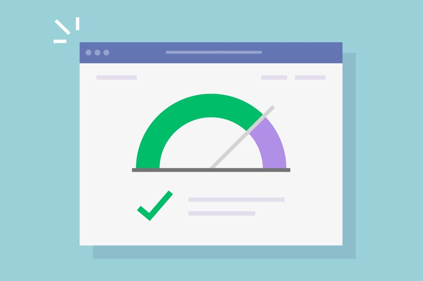
Your website loads faster with a modern, mobile-friendly design
A slow-loading website can be detrimental to your success. We all know from experience how quickly we expect things to load, and what do you do when they don’t load quickly? Probably leave the site. All those people leaving a site and not returning because they’ve found another company can impact you massively.
Additionally, many people abandoning your website can lead to an increased bounce rate. This will signal to the search engines that there is something wrong with your site and it isn’t providing users with the information they want. This will negatively impact your ranking position. Read our blog on SEO ranking factors.
A great hosting provider can help you to improve your website’s speed. We have a range of packages available.
Website planning for the future
Having a responsive website now puts you in a great position for the future. New devices are constantly being released with varying screen sizes, but if your site is already mobile-friendly, you’re more prepared for the next tech development.
All of this combined means you save yourself a lot of time working with one responsive website. A responsive design adapts to smaller screens and larger screens without you needing to put more effort into it. A great web designer can use media queries and CSS to design responsive websites.
We hope this blog has been useful and answered the question, what is responsive web design? Our web designers create unique, mobile-friendly websites for businesses across a range of industries. Are you thinking about having a new website? Get in touch with our friendly team today, we’re more than happy to help.